Font Optimisation Guide
This font optimisation guide is specifically about loading web fonts as quickly as possible but touches upon other aspects of web performance due to them being important overall. I've provided some use cases which I think would be helpful for some. For those of you who are a bit unfamiliar with how fonts work, I recommend opening a typography glossary and then reading everything.
What is a glyph?
A single character or symbol within a font.
What is a font subset?
A combination of characters and symbols makes up a set. Different font subsets are used in countries around the world depending on which language is used to communicate. Fonts can also include advanced typographic features such as small capital letters, different numeral styles, alternative characters as well as special symbols.
For example, In England, we generally only use the font subset of basic Latin.
The general exceptions to this are borrowed words, such as fiancée. So unless I suddenly decided to start a wedding photography business or a suit hire business in England, it's very unlikely that I'd require the Latin-extended font subset for my website, of course as with everything exceptions naturally exist and that would be if I wanted to target other European countries with my website content being served in additional languages such as French or German.
My favourite typeface on Google Fonts is Catamaran.
In some southern parts of India, they use the Tamil font subset, which has been designed and built into the Catamaran typeface.
If my website's intended audience was only my fellow Englishmen then it would make perfect sense for me to only want to have the basic Latin font subset and to remove the Latin-extended and Tamil font subset to reduce the overall size of my font files.
What are font styles and font weights?
Font styles are how a font has been designed to look depending on which value is set. Across the web, you'll see the following font styles and these font weights which apply to them. When you visit a website, each font style a website relies on is downloaded by your web browser to deliver a more pleasant reading experience.
| Common weight name | Value |
|---|---|
| Thin (Hairline) | 100 |
| Extra Light (Ultra Light) | 200 |
| Light | 300 |
| Regular | 400 |
| Medium | 500 |
| Semi Bold | 600 |
| Bold | 700 |
| Extra Bold | 800 |
| Black (Heavy) | 800 |
| Extra Black | 900 |
Choosing a web font
For website page speed purposes, you have a couple of choices when it comes to the loading of web fonts, the first option is very bland but the fastest, the second option is what I would recommend, and the third option which is relying on the Google Fonts CDN.
1. System Fonts
or as I like to call it "The font sacrifice"
System fonts are preinstalled on your computer. When you visit a website which has no custom fonts it will default to using these fonts, whether the website tells your computer which system font to load on their website can still be decided by the website owner, granted that you have it installed, otherwise, it will use another fallback font.
Bear in mind that most operating systems default to different system fonts and so your website will likely look different depending on the device used.
These fonts can be considered quite bland, but this remains a common tactic employed by a lot of larger websites. The reason behind this is that by not serving any custom fonts their website will load even faster as there are no custom fonts for users to download.
Fewer fonts to download = faster website.
2. Self-hosting and using fewer web fonts and making them smaller
My opinion is that custom fonts add beauty to a website and should be used, but in moderation to avoid slowing down your website and worsening user experience.
From a report commissioned by Google in 2018 we found out that milliseconds do indeed make millions, for every tenth of a second eBay managed to shave off their page load time they saw a large increase in user engagement and revenue.
By serving fewer and smaller fonts you get the best of both worlds, the beauty that custom fonts bring to a website and a quicker webpage load time.
Preload web fonts
When a user is first arriving on your website is when they are most likely to leave. By preloading the fonts on your website you speed up the process of having your web fonts appear on the above-the-fold content. To preload your web fonts make sure that the following is towards the top of the <head> section (simply replace your domain and font paths alike below):
<link rel="preload" href="https://example.com/fonts/open-sans-regular.woff2" as="font" type="font/woff2" crossorigin>
<link rel="preload" href="https://example.com/fonts/open-sans-semi-bold.woff2" as="font" type="font/woff2" crossorigin>
3. Google Fonts (CDN)
Overall it's hard to pick faults in what Google offers webmasters for free with Google Fonts the only option that seems to be missing is the ability to download the most common web font formats (WOFF/WOFF2) which are the norm for websites nowadays.
Below are some things for you to consider and take advantage of with Google Fonts.
Add preconnects
These lets your user's web browser know in advance that you need to connect to Google Fonts and priorities the connection. Since 2019 Google began to include this type of preconnect in the snippet they provide webmasters, so if your current website is older than that you may have missed out on including it. Example below:
<link rel="preconnect" href="https://fonts.googleapis.com">
<link rel="preconnect" href="https://fonts.gstatic.com" crossorigin>
Specify font subsets
Is your website only available in English and Russian? You should let Google Fonts know this in advance so that they only serve the font subsets required for your website's users.
You can do this by appending the required font subsets to the URL Google provides you with like so:
https://fonts.googleapis.com/css?family=Roboto&subset=latin,cyrillic
Just make sure that when choosing a Google Font it has been designed to support all the languages you intend to have website content written in.
Specify font-weights
Do you use only the regular and bold font weight across your website? Once again you should let Google Fonts know this by specifying which font weights are required like so:
https://fonts.googleapis.com/css?family=Roboto:wght@400;700
If you're unsure as to what font weights your website is currently using then take a look through your stylesheets.
Preload web fonts
When a user is first arriving on your website is when they are most likely to leave. By preloading the fonts on your website you speed up the process of having your web fonts appear on the above-the-fold content. To preload your web fonts make sure that the following is towards the top of the <head> section (simply replace your domain and font paths alike below):
<link rel="preload" href="https://example.com/fonts/open-sans-regular.woff2" as="font" type="font/woff2" crossorigin>
<link rel="preload" href="https://example.com/fonts/open-sans-semi-bold.woff2" as="font" type="font/woff2" crossorigin>
Common mistakes with self-hosting fonts
Now let's get into the common mistakes a lot of website owners make which cost their users time and both their revenue and bandwidth.
Serving too many fonts
Whilst having custom fonts is great, having too many of them slows down your website considerably. It's for this reason that I recommend using only one or two typefaces across your whole website and only certain font weights/styles, specifically regular, semi-bold and bold at max. These should suffice for adding adequate character to your website.
Do any other big companies do this?
Yes! A great example of this would be eBay. Taking a look at their website with developer tools we can see that only use a regular and semi-bold font. Kudos to them!
Serving fonts with non-required font subsets
Why do so many websites do this? Most of the time it's because fonts are quite often overlooked as a source of bulkiness that can be slimmed down.
Quite often I see this:
- Website owner downloads fonts in .TTF/.OTF format (such as from Google Fonts)
- Converts it online to WOFF/WOFF2 without choosing to remove any non-required font subsets.
The result? Very bloated font files.
You should make sure that you only include the font subsets required for your website by using Transfonter (free online service), Fontforge (open source software), or the free unofficial Google Webfonts Helper (if self-hosting a Google Font locally) to make sure your fonts are as small as possible for your website's users.
Please make sure to read through the font license before doing this to make sure it is permitted and check through your website's content to make sure you don't remove any characters currently in use, or those that you may require in the future.
Paid fonts are especially a big problem with this, as removing font subsets or characters in general from a font could be seen as you modifying the font, therefore violating your license agreement.
Serving icon fonts with non-required glyphs
Are you self-hosting an icon font such as FontAwesome? Icon fonts are a great addition to the web but self-hosting them without first removing non-required glyphs is a bad idea.
It's not just small websites that make this mistake either, some of the biggest companies in the world are doing it right now.
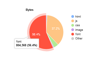
The website below uses a total of 12 glyphs from Font Awesome but serves the whole package of 745kb in WOFF format. This results in the FontAwesome making up more than half of the total webpage size.
By specifically selecting those 12 icons on a tool such as IcoMoon (for modifying the free version of FontAwesome only) or by using font design software such as Fontlab (works for both free and paid versions of FontAwesome), we can shrink that down to less than 15kb by removing all of the non-required glyphs.
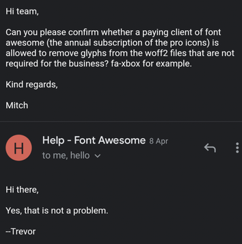
Not only is FontAwesome awesome but the team behind it are too. As a paid customer of FontAwesome, you're also permitted to remove non-required glyphs from the pro version of FontAwesome. My email from them below confirms this:
Last tip:
If you haven't already, make sure that your website has HTTP2 enabled and that your website's assets are being compressed with GZIP at the very minimum or BROTLI if available for maximum compression.
Closing thoughts
Overall as internet infrastructure around the globe continues to get better I think we'll find these pagespeed techniques become less and less important as our devices will no doubt be loading websites super fast regardless of how poorly optimised they are. But until then... Optimise everything! I will add bits about variable fonts at a later date.
Has this guide helped you?
I'm glad that the amount of time I've spent on it hasn't gone to waste! Please consider leaving a review for our website or linking back to this article. We'd very much appreciate it.